| विषयमा पृष्ठहरू: [1 2] > | Suggestions for "new" KudoZ interface थ्रेड पोस्टर: Zea_Mays
|
|---|
Zea_Mays 
Italy
Local time: 12:44
सदस्य (2009)
English to German
+ ...
| | On listening | Aug 23, 2023 |
Hi Zea_Mays,
Feedback or suggestions on the KudoZ interface, or whatever else, are always welcome, of course. I'm posting more in reaction to your thread title, however. The ProZ.com team does listen, and a bit more (as I'll explain in a moment). Sometimes, I've seen the they don't listen argument crop up when the issue is they didn't do what I wanted or expected of them, which would be a perfectly valid complaint, expressed as such. But I don't think it is fair to sa... See more Hi Zea_Mays,
Feedback or suggestions on the KudoZ interface, or whatever else, are always welcome, of course. I'm posting more in reaction to your thread title, however. The ProZ.com team does listen, and a bit more (as I'll explain in a moment). Sometimes, I've seen the they don't listen argument crop up when the issue is they didn't do what I wanted or expected of them, which would be a perfectly valid complaint, expressed as such. But I don't think it is fair to say the team doesn't listen to feedback and suggestions.
The reason why, on ProZ.com at least, you can have two versions of an interface for something like KudoZ co-existing for what, in many places, would be an overly-extended period of time, has to do with that. On many (most?) platforms, an update to something gets rolled out, there is a short period where some people complain about the change, and the new version is imposed more or less at once, deal with it. The newer version of KudoZ grew out of the old interface and out of feedback and suggestions from users, and a desire to include or improve information or tools which were relevant to the different parties involved (askers, the people needing help, and answerers, the people providing it). I don't think either version is perfect. But once something gets put out there, one of the things the ProZ.com team does is watch usage (the overwhelming majority of users do not speak up in the forums, so you have to try to listen to them somehow, too, and usage and usage patterns are key to doing this). Monitoring the usage of something helps tell you if it is a real improvement or not, and can indicate further improvements which will make it more useful to more people. I think, ideally, something like the KudoZ interface gets refined, iterated upon, until it reaches a point where it is more useful to all involved than the old interface. And if not, maybe it just goes away, or a different thing gets tried.
In terms of usage, as of today, around 16,300 users have switched to the new version of KudoZ and not switched back. 3,063 users have switched to the new version but then went back to using the old version. That indicates, to me, that it's not all terrible and hopeless and ready for the drawing board from scratch, but that with some work, it might just turn out better. Let's see.
Just thought I'd weigh in on the topic of listening, at least. I hope that provides some context, which I am told can make or break a KudoZ question, anyway. 
Jared ▲ Collapse
| | | | Zea_Mays
Italy
Local time: 12:44
सदस्य (2009)
English to German
+ ...
विषय आरम्भक
May I ask what's your personal opinion when just visually comparing the two UIs?
Looking at the pictures zooming out is the best way to see the difference.
I have some experience with UX and web design btw.,
and "usage" does not mean they actually like the new one,
it could just mean they didn't notice the very small hint to switch back.
I am not saying to discard the new version, I just think the new UI
can be improved in o... See more May I ask what's your personal opinion when just visually comparing the two UIs?
Looking at the pictures zooming out is the best way to see the difference.
I have some experience with UX and web design btw.,
and "usage" does not mean they actually like the new one,
it could just mean they didn't notice the very small hint to switch back.
I am not saying to discard the new version, I just think the new UI
can be improved in order to be at least that clear as the old one or even better.
(The rather vintage colour style is another story... ) ▲ Collapse
| | | | | Dealing with it – or quitting | Aug 24, 2023 |
Jared Tabor wrote:
On many (most?) platforms, an update to something gets rolled out, there is a short period where some people complain about the change, and the new version is imposed more or less at once, deal with it.
This is true. But if people hate a new UI enough, they sometimes quit instead of dealing with it. I stopped using Facebook when they replaced navigation text with incomprehensible hieroglyphs, for example (and saved a lot of time). Their growth stopped around the same time, but I obviously don't know if this is related to the UI update. FB is increasingly full of trash instead of posts from one's network, and there are probably many other reasons for the decline.
A new useless UI in an online backup system almost made me quit, and when they made one more unwanted change, I quit.
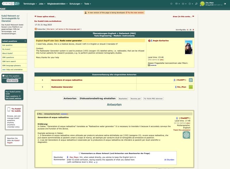
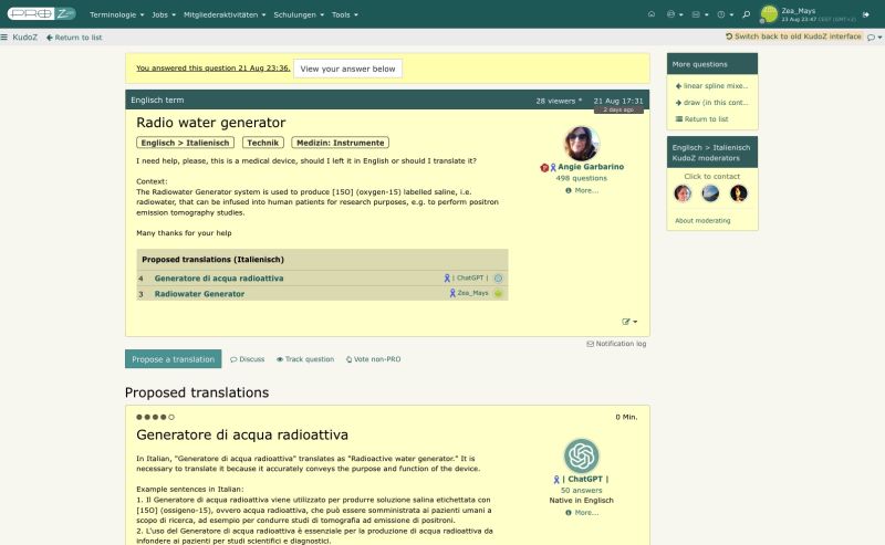
Proz's new UI isn't nearly as bad now as when it was first introduced, but it lacks the variation and choice of colours and the contrasts that make it easy to determine visually where you are on the page and quickly find the section you need. There is a bit too much 'pea soup'. In some of the earlier versions, I think 'Vote non-PRO' had been hidden behind an 'Edit' icon. It looks like this has been fixed. I guess it was Windows 8 that started the infuriating trend of hiding UI elements to present a 'clean' UI, as if a UI were an art exposition and not a collection of tools we need. I guess Proz was briefly blinded by this nonsense. The vertical dividing lines in the old version also helps give the user a visually structured overview of the page, and the ruby/Bordeaux fonts were a lot more readable than the pea soup fonts.
Wouldn't it be possible to teleport the best things from the old UI into the new one and try to consolidate them?
| | |
|
|
|
| Damned statistics | Aug 24, 2023 |
Jared Tabor wrote:
In terms of usage, as of today, around 16,300 users have switched to the new version of KudoZ and not switched back. 3,063 users have switched to the new version but then went back to using the old version. That indicates, to me, that it's not all terrible and hopeless and ready for the drawing board from scratch, but that with some work, it might just turn out better. Let's see.
Interesting. Nothing like facts to spoil the fun. Unless the 16,300 were started on the new version in the first place?
It's certainly more mobile-friendly, but on a PC the old version is way better, so please keep it.
| | | | | One huge shortcoming and some smaller ones | Aug 24, 2023 |
I won't say the new interface is unfixable, but it has one huge shortcoming that would make even the best site very unpleasant to use: those big blank margins. They are a waste of screen real estate, which is a big no-no. Besides that, proportions of font size to design element size in the new interface are suitable for mobile devices, but look wrong on a PC monitor.
| | | | Zea_Mays
Italy
Local time: 12:44
सदस्य (2009)
English to German
+ ...
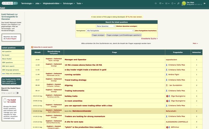
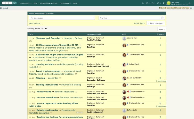
विषय आरम्भक | Proz Homepage comparision with comments | Aug 24, 2023 |
Now with the Homepage, old vs new UI.
I added comments on some elements, just take them as my personal opinions
based on my experience with web design.
>>> Note where the switch-to-new/back-to-old-ui-option is located on the pages and how it is formatted! (red circle)
Important but almost hidden options are part of DARK PATTERNS.
HOMEPAGE - old UI
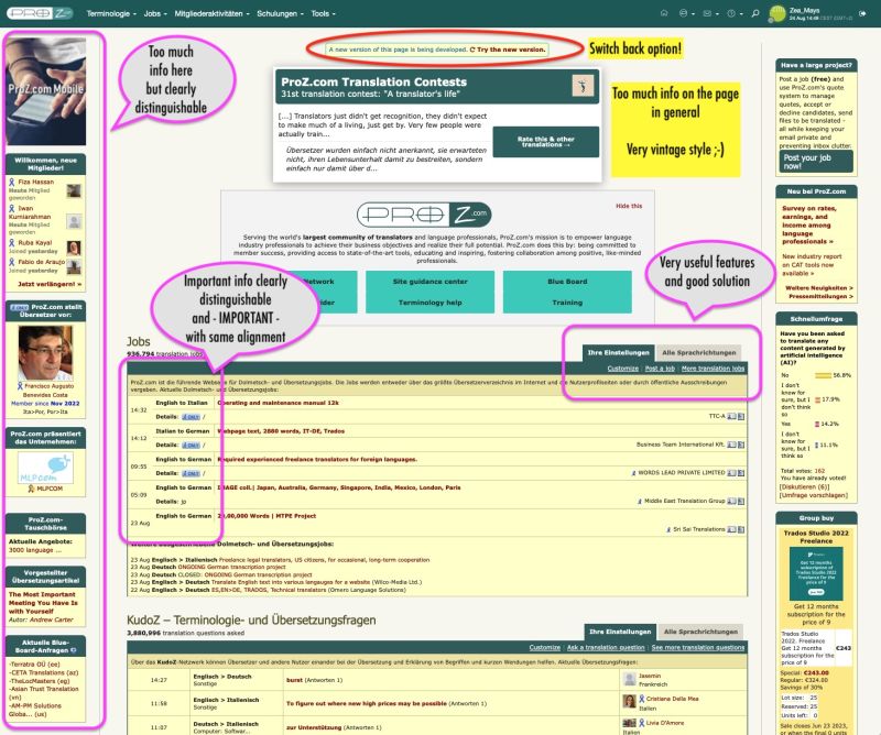
HOMEPAGE - new UI
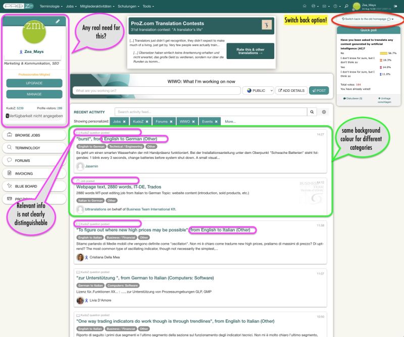
[Bearbeitet am 2023-08-24 13:32 GMT]
[Bearbeitet am 2023-08-25 08:35 GMT]
| | | | expressisverbis
Portugal
Local time: 11:44
सदस्य (2015)
English to Portuguese
+ ...
| I once saw this happen | Aug 24, 2023 |
Thomas T. Frost wrote:
This is true. But if people hate a new UI enough, they sometimes quit instead of dealing with it.
A new useless UI in an online backup system almost made me quit, and when they made one more unwanted change, I quit.
Proz's new UI isn't nearly as bad now as when it was first introduced, but it lacks the variation and choice of colours and the contrasts that make it easy to determine visually where you are on the page and quickly find the section you need.
Wouldn't it be possible to teleport the best things from the old UI into the new one and try to consolidate them?
I once saw this happen on two platforms, one aimed at linguists, the other at a more specific area.
Both communities lost several members after a while, me including. The latter platform no longer exists, it's only visible on the Web if I'm not mistaken.
It would be very sad to see that happen with Proz...
For me, the new user interface is too compact and there are options that you have to dig through to find them.
I think it would be much better if the bugs that appear almost all the time and which cause constraints to its members could be fixed once and for all. I know it's not easy to fix it so quickly...
And I agree, if we can get the best of both worlds that would be wonderful!
| | |
|
|
|
| My vote for the KudoZ site: | Aug 24, 2023 |
Please leave (the choice) for the original version, when it comes to access via PC (or MAC), and remain to offer the new version for Android (or iOS), which is rather brilliant to my mind.
| | | |
Matthias Brombach wrote:
Please leave (the choice) for the original version, when it comes to access via PC (or MAC), and remain to offer the new version for Android (or iOS), which is rather brilliant to my mind.
This is what I was wondering about. There's a disease that's been spreading through the web for some years now, which leaves all infected pages "optimised" for smartphones, meaning that on the wide screen of a PC they look like crap (and often don't work right either).
But this is unnecessary. It's a while since I was actively involved in web page design, but I believe that html still has built in structures that let you serve different versions of a site, depending on what kind of device the viewer is using. It's mainly to do with the way you set up the formatting for different content items.
Is something like this beyond the capabilities of the ProZ tech department?
| | | | Zea_Mays
Italy
Local time: 12:44
सदस्य (2009)
English to German
+ ...
विषय आरम्भक | responsiveness & horiziontal orientation | Aug 25, 2023 |
Philip Lees wrote:
... There's a disease that's been spreading through the web for some years now, which leaves all infected pages "optimised" for smartphones, meaning that on the wide screen of a PC they look like crap (and often don't work right either).
But this is unnecessary. It's a while since I was actively involved in web page design, but I believe that html still has built in structures that let you serve different versions of a site, depending on what kind of device the viewer is using. It's mainly to do with the way you set up the formatting for different content items.
So called responsive design allows you to do exactly that. If you know you have a larger
audience using desktops, you'll build a proper desktop version for them.
I think there is also a new trend coming up: portable screens for mobile devices,
as people get more and more tired about fiddling around on small displays.
This again means horizontal instead of vertical orientation.
| | | | | I wonder then.... | Aug 25, 2023 |
Jared Tabor wrote:
In terms of usage, as of today, around 16,300 users have switched to the new version of KudoZ and not switched back. 3,063 users have switched to the new version but then went back to using the old version. That indicates, to me, that it's not all terrible...
Ice Scream wrote:
Interesting. Nothing like facts to spoil the fun. Unless the 16,300 were started on the new version in the first place?
It's certainly more mobile-friendly, but on a PC the old version is way better, so please keep it.
Does this mean then, that to express dissatisfaction, one needs to switch to the new and then switch back, rather than not switch at all....?
| | |
|
|
|
| Total number of users | Aug 25, 2023 |
Jared Tabor wrote:
In terms of usage, as of today, around 16,300 users have switched to the new version of KudoZ and not switched back. 3,063 users have switched to the new version but then went back to using the old version.
What is the total number of users for each version on desktops/laptops, regardless of any switching?
I suggested a poll related to new/old UI preference a few days ago. Let's hope it is published soon.
| | | | Tom in London
United Kingdom
Local time: 11:44
सदस्य (2008)
Italian to English
| Desktop only | Aug 25, 2023 |
Thomas T. Frost wrote:
...I suggested a poll related to new/old UI preference a few days ago. Let's hope it is published soon.
I use desktop only - mainly because when I want to access Proz, I'm working on my desktop, doing translations.
I've tried using the Proz app for iPhone and find it irrelevant to the way I function. It's certainly no good at all for doing translation work. So I deleted it.
[Edited at 2023-08-25 11:34 GMT]
| | | | Zea_Mays
Italy
Local time: 12:44
सदस्य (2009)
English to German
+ ...
विषय आरम्भक | Many people use mobile _and_ desktop | Aug 25, 2023 |
Thomas T. Frost wrote:
What is the total number of users for each version on desktops/laptops, regardless of any switching?
I suggested a poll related to new/old UI preference a few days ago. Let's hope it is published soon.
I thought to do the same but then realised it would be limiting and limited, as:
- many of us use both
- you'd need to understand if mobile users use the app or a browser
- you'd need to understand the reasons for a preference in order to be able to make improvements
- you'd need to understand which parts of the website are consumed on which devices
(to be completed)
But knowing exact numbers would be interesting.
The "switched not back" argument is not valid as the switch back option is almost hidden in the new UI (dark pattern technique), at least in the desktop version.
[Bearbeitet am 2023-08-25 11:49 GMT]
| | | | | विषयमा पृष्ठहरू: [1 2] > | To report site rules violations or get help, contact a site moderator: You can also contact site staff by submitting a support request » Suggestions for "new" KudoZ interface | Wordfast Pro | Translation Memory Software for Any Platform
Exclusive discount for ProZ.com users!
Save over 13% when purchasing Wordfast Pro through ProZ.com. Wordfast is the world's #1 provider of platform-independent Translation Memory software. Consistently ranked the most user-friendly and highest value
Buy now! » |
| | CafeTran Espresso | You've never met a CAT tool this clever!
Translate faster & easier, using a sophisticated CAT tool built by a translator / developer.
Accept jobs from clients who use Trados, MemoQ, Wordfast & major CAT tools.
Download and start using CafeTran Espresso -- for free
Buy now! » |
|
| | | | X Sign in to your ProZ.com account... | | | | | |